Drongo Nest: Building a Brand for Sustainable Farm Produce
Drongo Nest is a farm built on the belief that good produce begins with responsible stewardship of the land. As the business prepared to introduce its products to customers, it needed a brand that felt as genuine as the farming practices behind it.
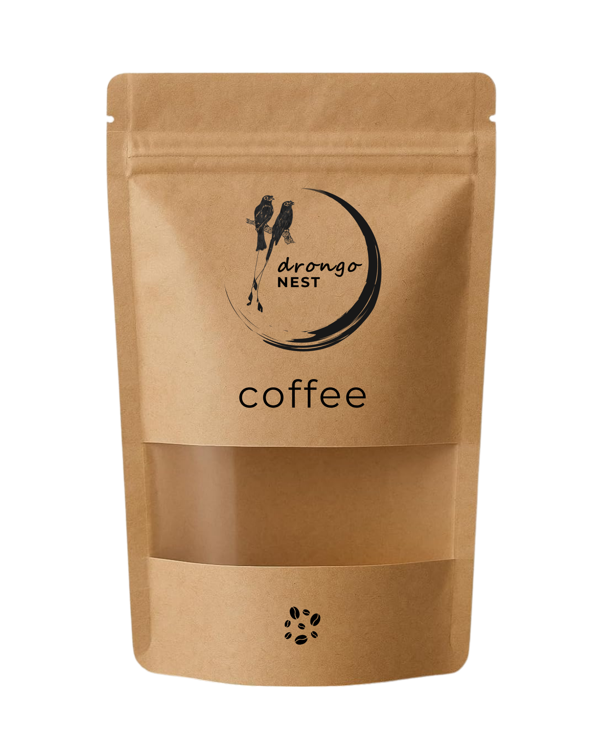
Working closely with the founder, I created a scalable visual identity, packaging system, and website that introduced the farm, its products, and its philosophy through a consistent and understated design language.
Overview
Drongo Nest produces farm-grown coffee, spices, and other natural products from its estate in Kerala. As the business expanded beyond the farm itself, it required a brand that could establish credibility while remaining rooted in its agricultural origins.
The engagement covered the complete customer-facing identity, from logo refinement and packaging to a simple webpage, creating a unified experience across both physical and digital touchpoints.
Context
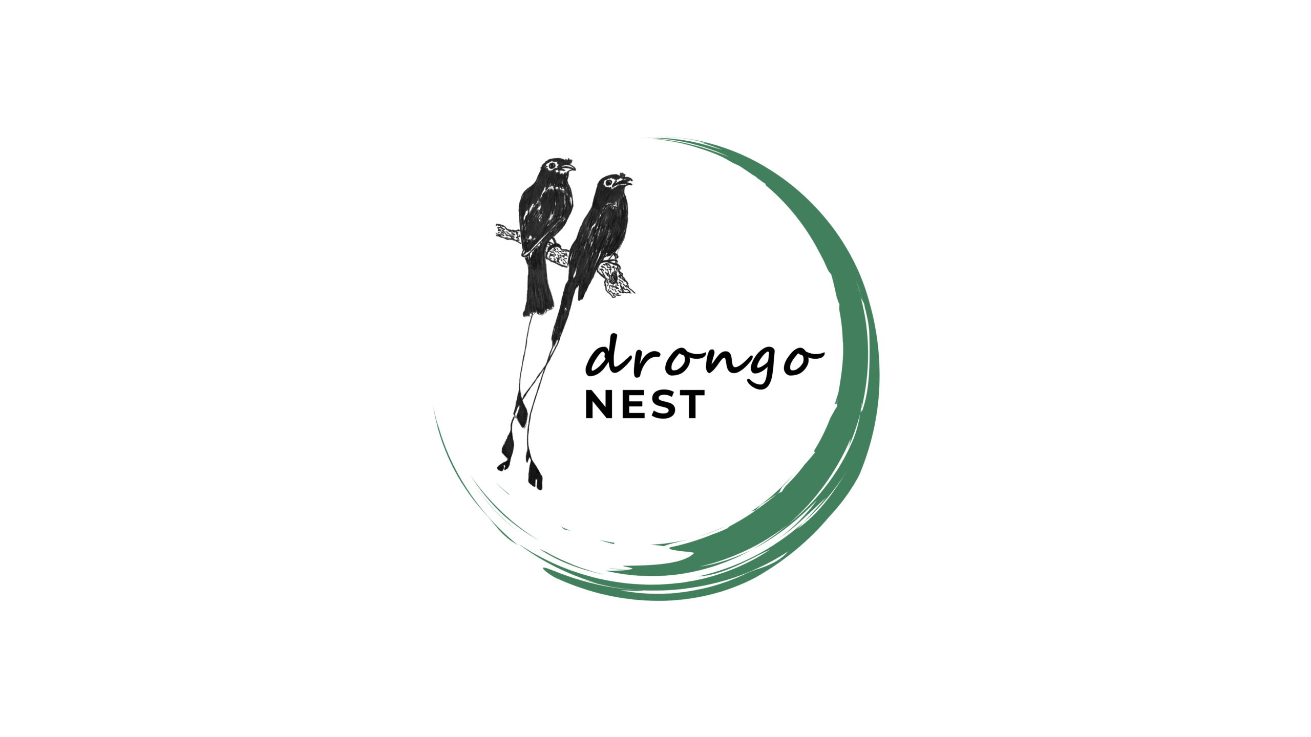
The project began with an illustration of the drongo bird created by the founder. Rather than replacing this with a completely new identity, the opportunity lay in developing it into a practical logo and building a visual system around it.
At the same time, the packaging needed to work across multiple products with different information requirements while remaining immediately recognisable as part of the same brand family.
Challenge
The challenge was not simply to design attractive labels, but to create a brand that could grow alongside the business.
The identity needed to accommodate an expanding range of products, communicate quality without relying on excessive visual embellishment, and remain practical to produce in small batches. Every element, from typography and layout to material selection, had to reinforce the farm’s values without making sustainability its only message.
Approach
I approached the project by first establishing the core visual language before designing individual applications.
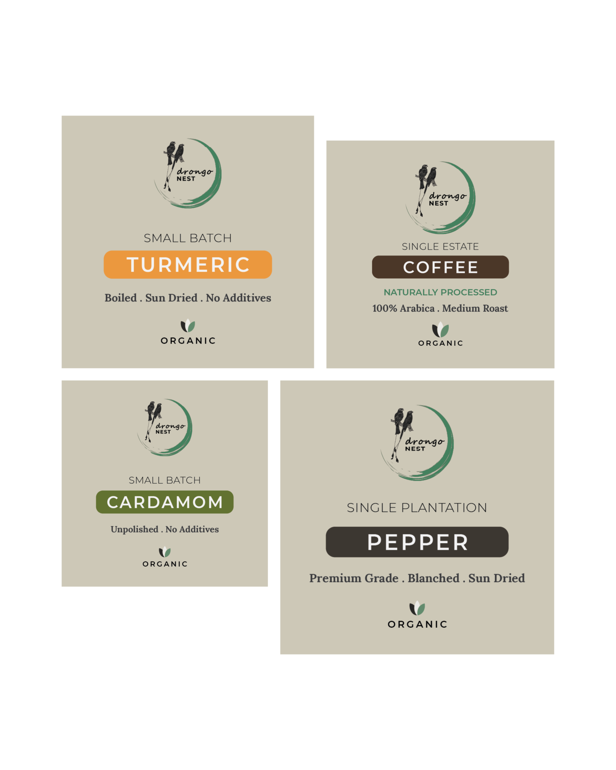
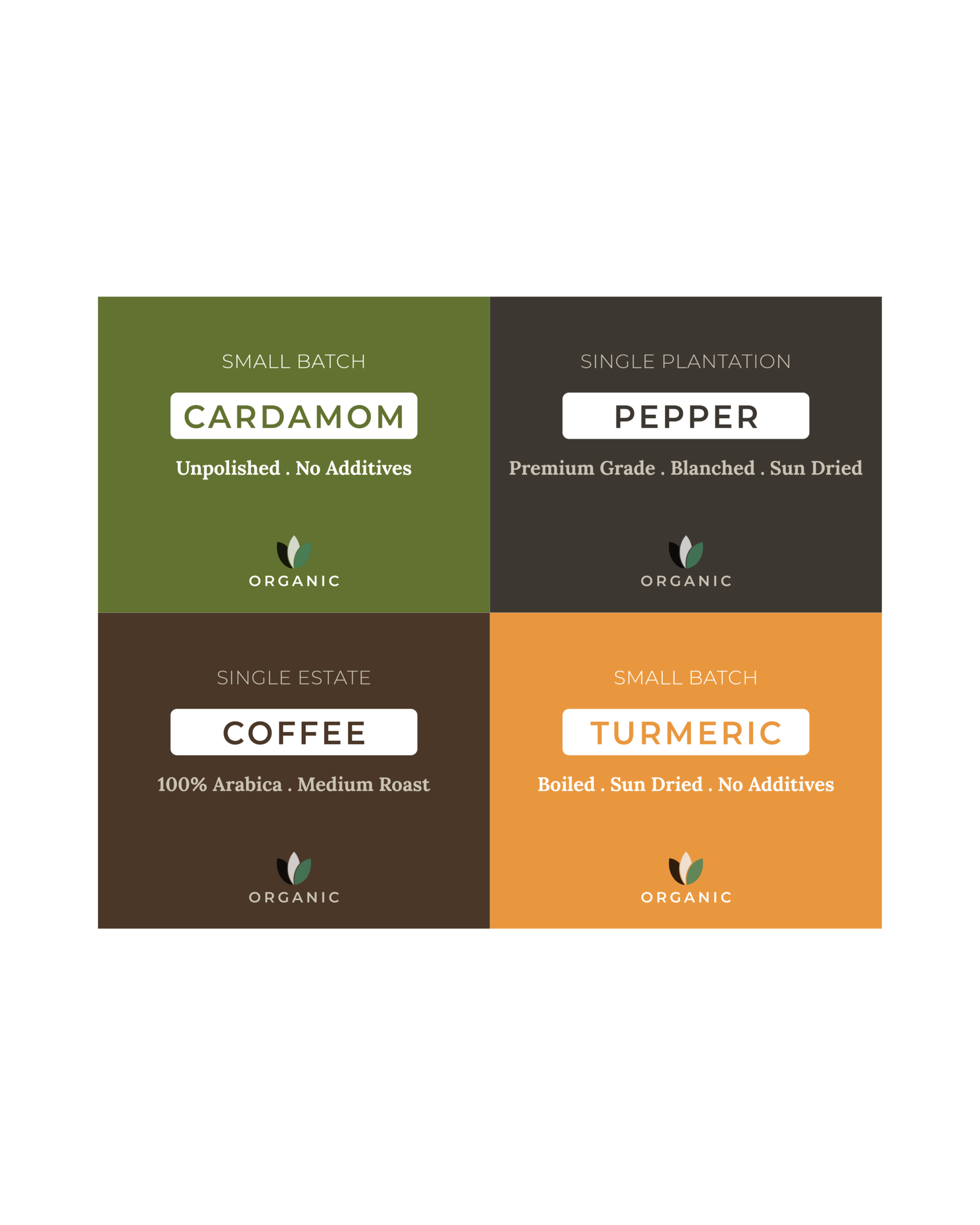
The founder’s bird illustration became the foundation of the logo, which was then supported by a restrained typographic system, flexible packaging layouts, and a consistent information hierarchy. This allowed every product to retain its own identity while clearly belonging to the same family.
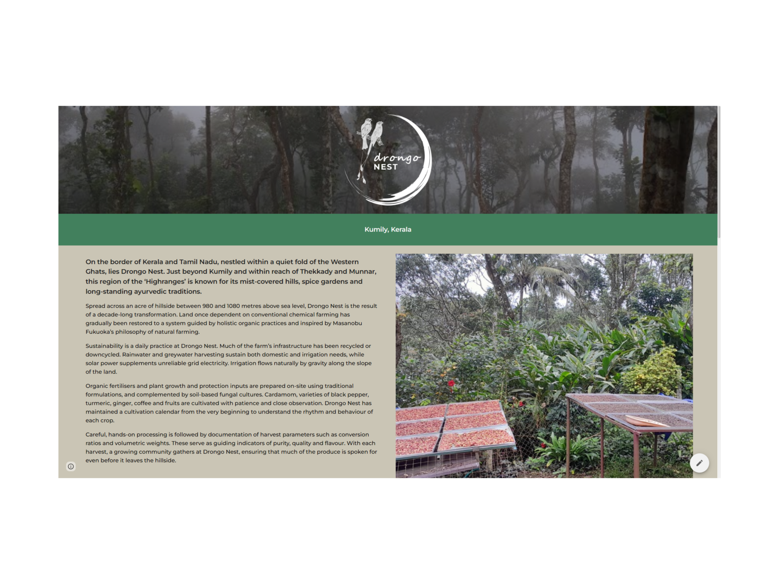
The webpage adopted the same visual language, providing customers with a straightforward introduction to the farm and its produce.
Process
The engagement included:
- Refining the original bird illustration into the Drongo Nest logo.
- Developing the visual identity.
- Designing packaging for coffee, pepper, cardamom, turmeric, and other products.
- Creating a modular label system that could accommodate future additions.
- Designing and publishing the webpage.
- Selecting paper-based label material to better align with the farm’s environmental philosophy.
Key Decisions
The project was guided by a few simple principles:
- Preserve the founder’s original vision by evolving rather than replacing the existing bird illustration.
- Build a packaging system that could expand with the product range.
- Keep the visual language clean and understated, allowing the products to remain the focus.
- Extend the same design principles across packaging and the webpage.
- Reflect the farm’s sustainability philosophy through both communication and material choices.
Outcome
The branding and packaging were successfully taken into production and now provide Drongo Nest with a consistent identity across its growing product range.
Together with the webpage, the project established a clear public presence that communicates the farm’s products and philosophy without relying on elaborate marketing or exaggerated claims.
Reflection
One aspect of this project I particularly enjoyed was working with an idea that already existed rather than starting from a blank page.
Instead of inventing a completely new identity, the process became one of refinement, understanding the founder’s intent, strengthening it through design, and creating a system that could evolve with the business. It was a reminder that effective branding is often less about creating something entirely new and more about expressing an existing story with clarity and consistency.
Project Gallery